Design
SaaS Dispatch Case Study
Role: User Experience Architect
Design & Development of a SaaS EMS Dispatching System
Objective
Create a ground-up dispatching SaaS solution completely driven by a dispatcher's daily requirements.
Tools & Methodology
- Top tasks research
- User testing
- Story mapping
- Information architecture
- User flows
- Wireframes
- UI design
Overview
In the landscape of computer aided dispatching (CAD) systems, most are on-premise enterprise solutions. This project saught to lead the way in the trend of many EMS operations moving to the cloud.
Research
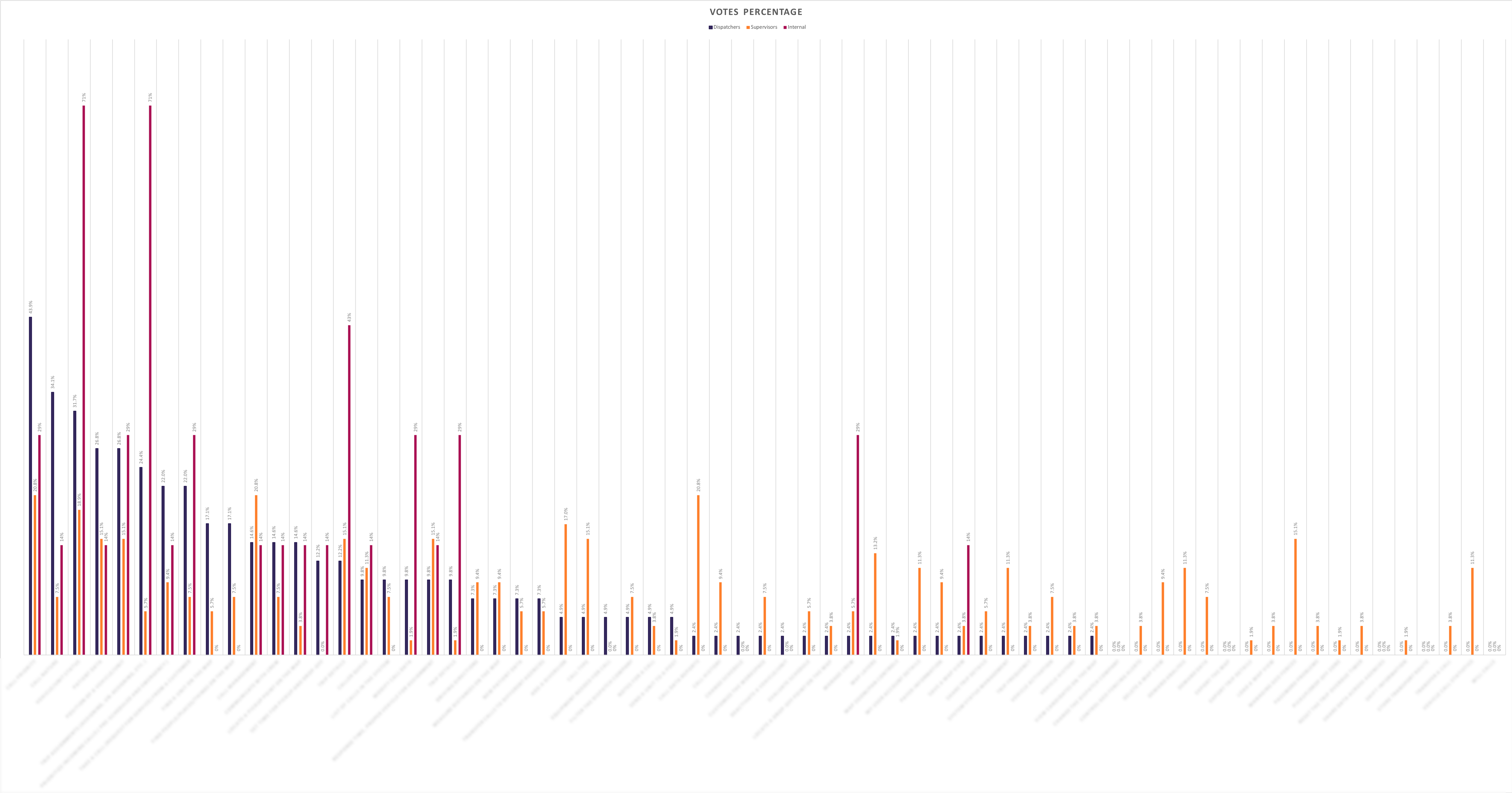
It was important to understand what dispatchers needed most when using a CAD system. To do this, I initiated a top tasks research effort designed to understand the dispather's greatest needs. Here's an article I wrote on top tasks.
I also used the System Usability Scale to gage the usability of the existing enterprise dispatch product. Doing so gave me a baseline for the future that I could compare the overal app performance to.
In addition to the quantitative datasets, I spent many hours with dispatchers across the country to understand the similarities and nuances between dispatch companies. Dispatchers (and all users) rarely use our products in isolation. It was important to understand the environmental factors that influeced how they used their dispatching tools.
All this research fed into the next step:
How Do We Build This Thing?
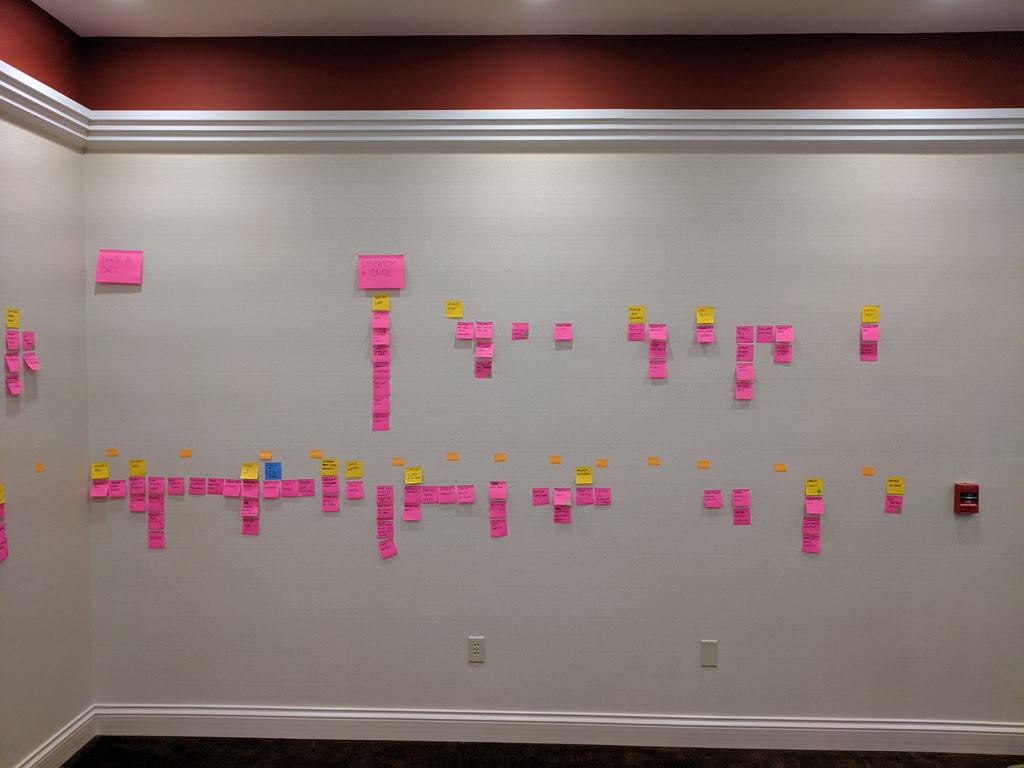
I facilitated a series of workshops with stakeholders and teammembers to lean into why we're making the product and map out the entire dispatcher's activity experience. Based on industry expertise and research, we grabbed hold of a whole lot of sticky notes and covered the walls of a conference room with activities and tasks. This enabled us to gain a high-level look at the software we were going to build and how it would meet our end-user's needs.
We also asked ourselves four important questions:
- Why are we creating this product?
- How is this product going to benefit our company?
- What will separate the product from the competition?
- What problems will the product solve for the dispatcher?
Each person on the team answered the four questions on their own, and then we came together as a team and discussed our answers. It was a powerful way to ensure we were all on the same page.
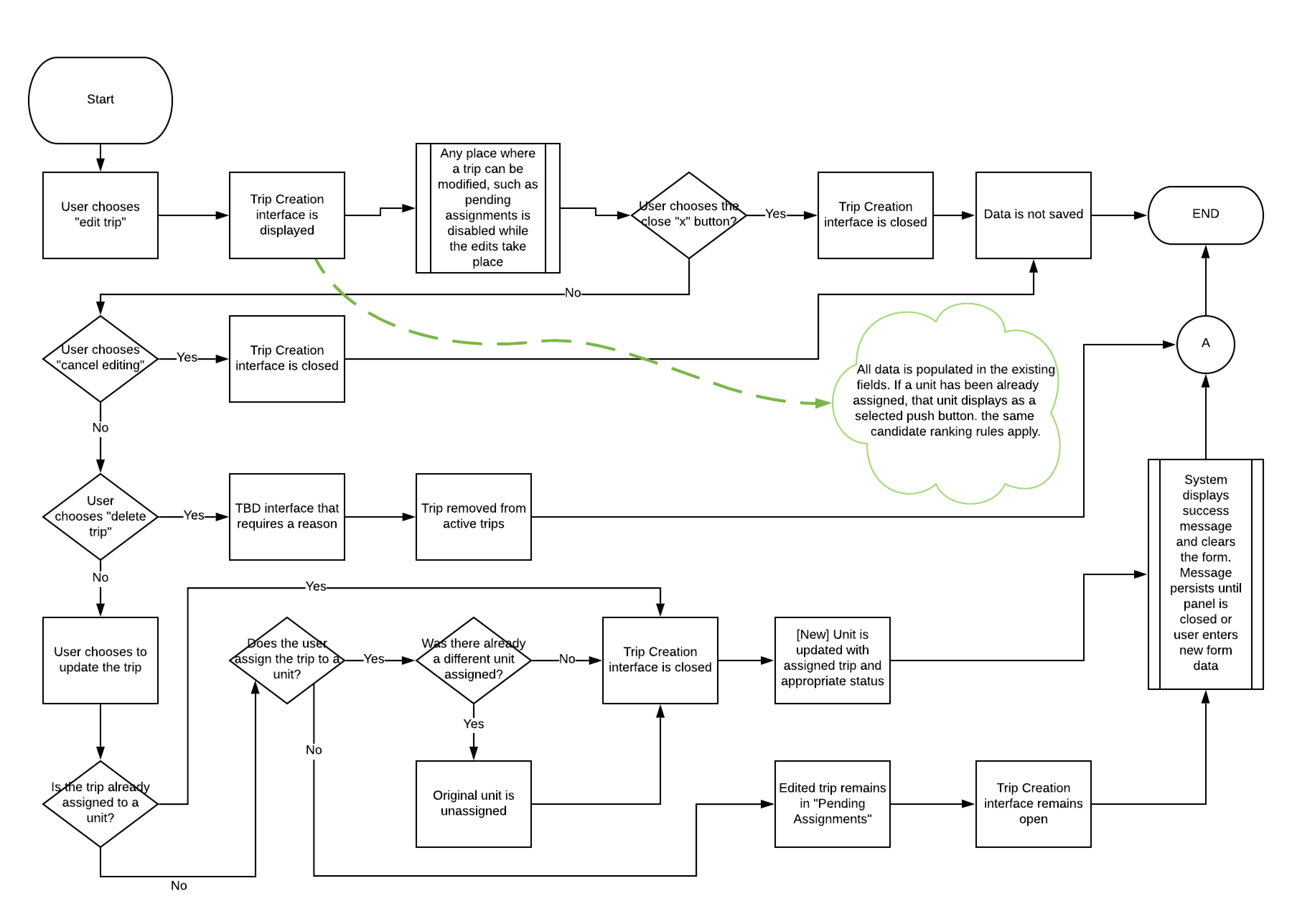
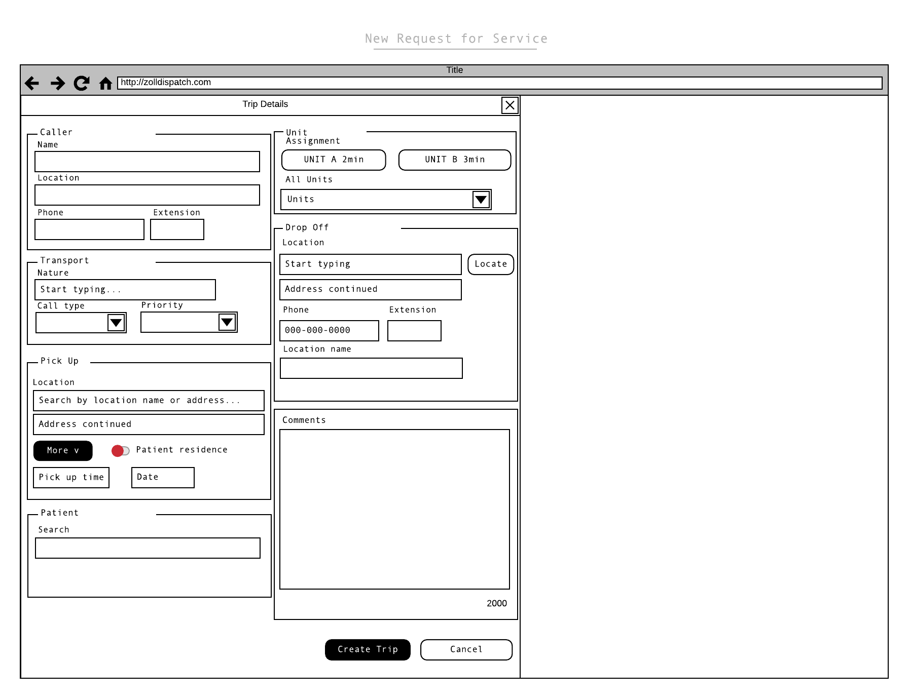
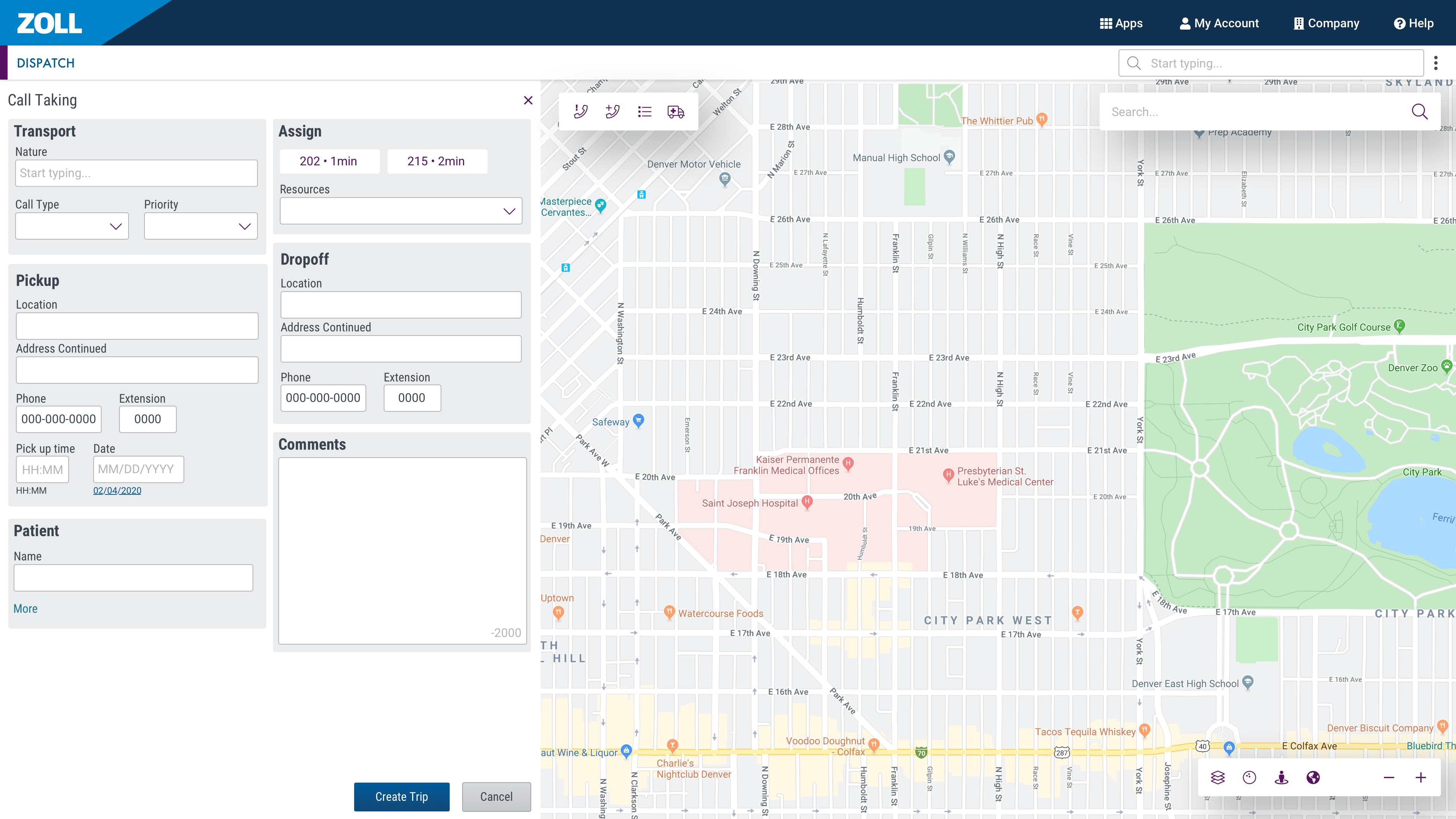
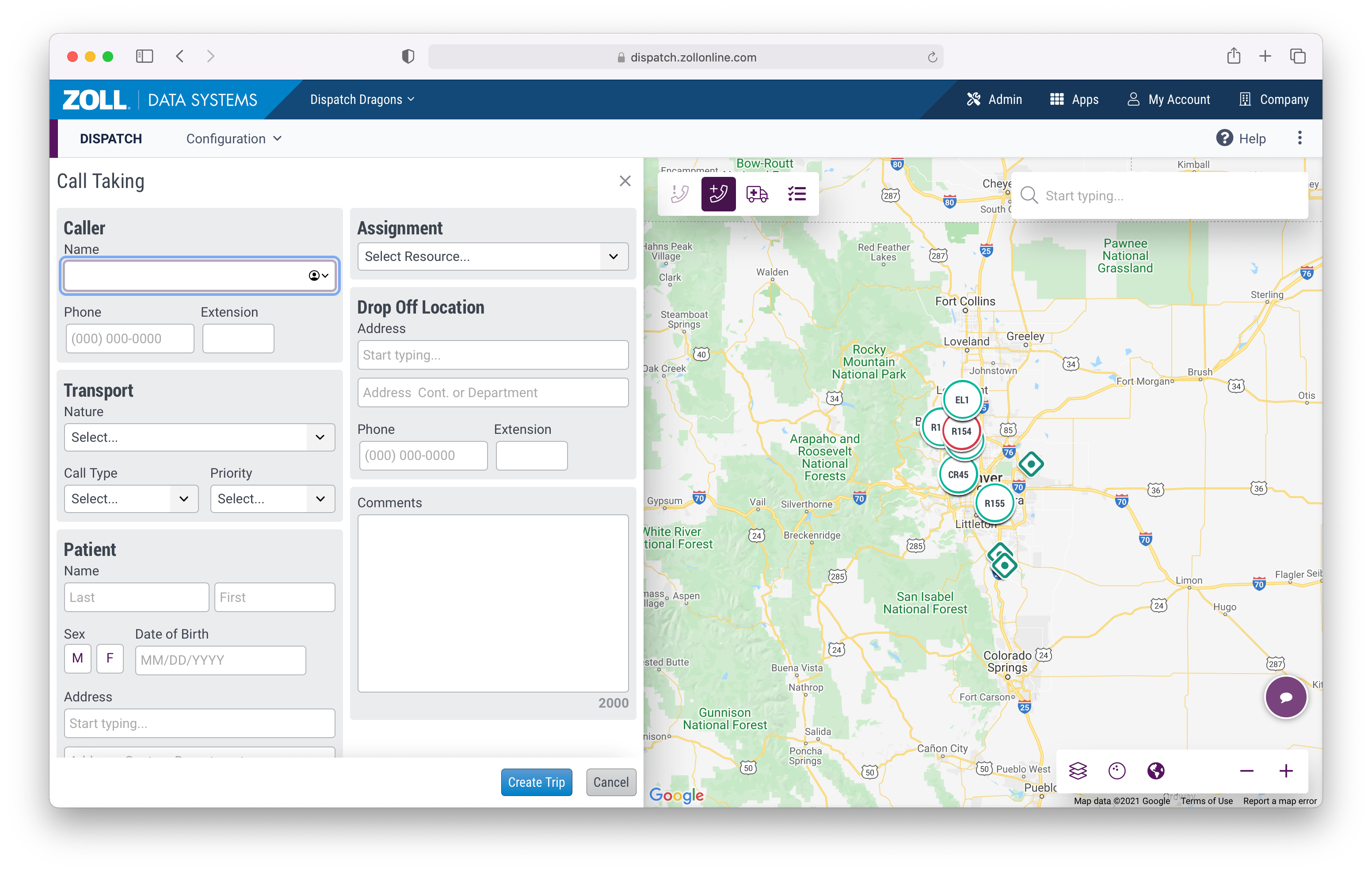
Design
The application's features were typically designed around specific tasks. So for each task, a user flow and wireframe combo were usually necessary. If it was a new UI element, a mockup would be created. Here is an example of one portion of the dispatch application with flows, wireframes, mockup, and finally the live result.
