Case Study
Walkie Talkie for First Responders
Role: User Experience Strategist
Working to bring clarity to a loosely-defined feature. Before my joining the team, they had an idea of what they wanted to build, however did not have a shared vision and objective.
Objective
Bring design and feature clarity to a walkie-talkie app made for EMS companies to reduce radio chatter and the number of technology pieces medics and dispatchers need to use.
Tools & Methodology
- User flows
- Wireframes
- Prototype
Challenges
I was brought onto the development team mid-way through the larger project. The walkie-talkie feature lacked even the most basic level of design clarity. Product wanted the feature, and there were a few user stories, but there was no design or research specifically (aside from contextual inquiries I'd performed earlier in the year). Challenges included:
- a lack of feature design and architecture
- team disagreement as to what the feature should be
- pressured time frame to develop a releasable feature
Solution
The feature was not going anywhere until we established clear user needs, detailed design flows, and UI design. The design had to cover not only the happy paths, but also error and edge cases, since the nature of the feature meant the user had to understand completely how the system was working at all times.
Research & Collaboration
I began by going back to the needs I’d discovered while I had travelled to multiple locations across the country talking to medic agencies. While doing contextual inquiries it was discovered that reducing the ways medics communicate was a significant need. I then had in-depth discussions with the Product Manager and Product Owner to understand how they were approaching the feature from a business point of view. Finally, I had in-depth technical discussions with my lead developers to understand the technical landscape I’d be designing within.
Deliverables
After hitting the reset button, verifying user needs, and understanding the business and technical requirements, I was able to craft the design. I:
- reframed user stories, wrote new stories, broke apart stories
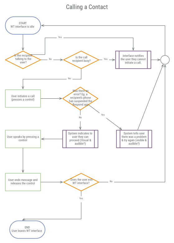
- mapped out detailed user and system flows for how calls would be made and experienced
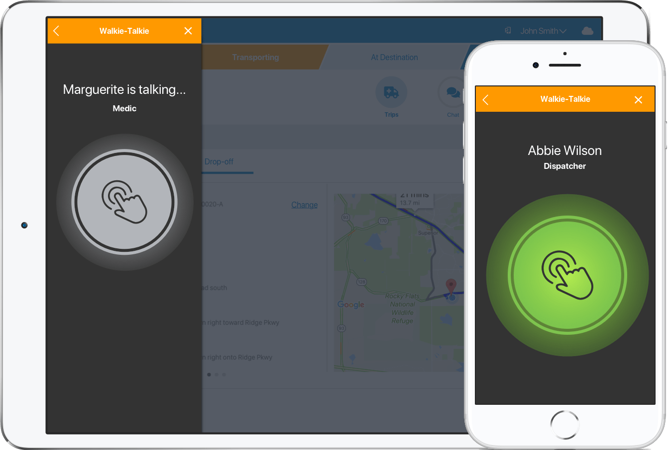
- created UI designs that covered all known states of the system (exposed by the detailed user flows)
- built an HTML/CSS/JS working prototype that was used to illustrate concepts during our planning meetings, remove any ambiguity in discussions, and development questions
Success
With the re-written stories and designs each story could directly point to, the development team was able to get back on track and gain development momentum. I maintained a close working relationship, answering questions and updating the design if needed, as the feature was developed.
Examples
Process Flow

Prototype
View the prototype in the CodePen
UI Design
