Case Study
Establishing a Style Guide
Building a style guide from scratch for a company which had no front-end developers or designers.
There is little I love more than designing, developing, and documenting. A style guide is the confluence of all three. I love them. This post highlights the style guide I created at my current company. Here I'll mainly cover the process, hitting just the high points. In another post, I will focus on the technical and discuss the way in which I built and utilized Jekyll to create the style guide.
Opportunity
The need for a company style guide, or pattern library, was a big one. The company was undergoing a shift in the way it delivered software, namely transitioning to a SaaS model. The company’s many products were being folded into one platform. This gave rise to many challenges, and one large challenge was the extreme diversity in experiences and design. There was a need for a unification.
As part of our role in the company, the UX team fielded many questions from developers about UI and UX patterns. To various degrees, each of us had different levels of tribal knowledge (dangerous), and we were well aware we had no centralized repository of information to which we could point a developer. It was clear a style guide wasn necessary. But just because we all wanted one, didn’t make the process easy.
The ideal way I wanted to implement this style guide was actually for it to be a pattern library—a library of code and design snippets, directly connected to the company codebase, from which a developer could pull live methods, controllers, etc. to be used in their own code. This was not to be for the first round, however, since the user experience team did not have a back end developer, nor did they have access to one in the company.
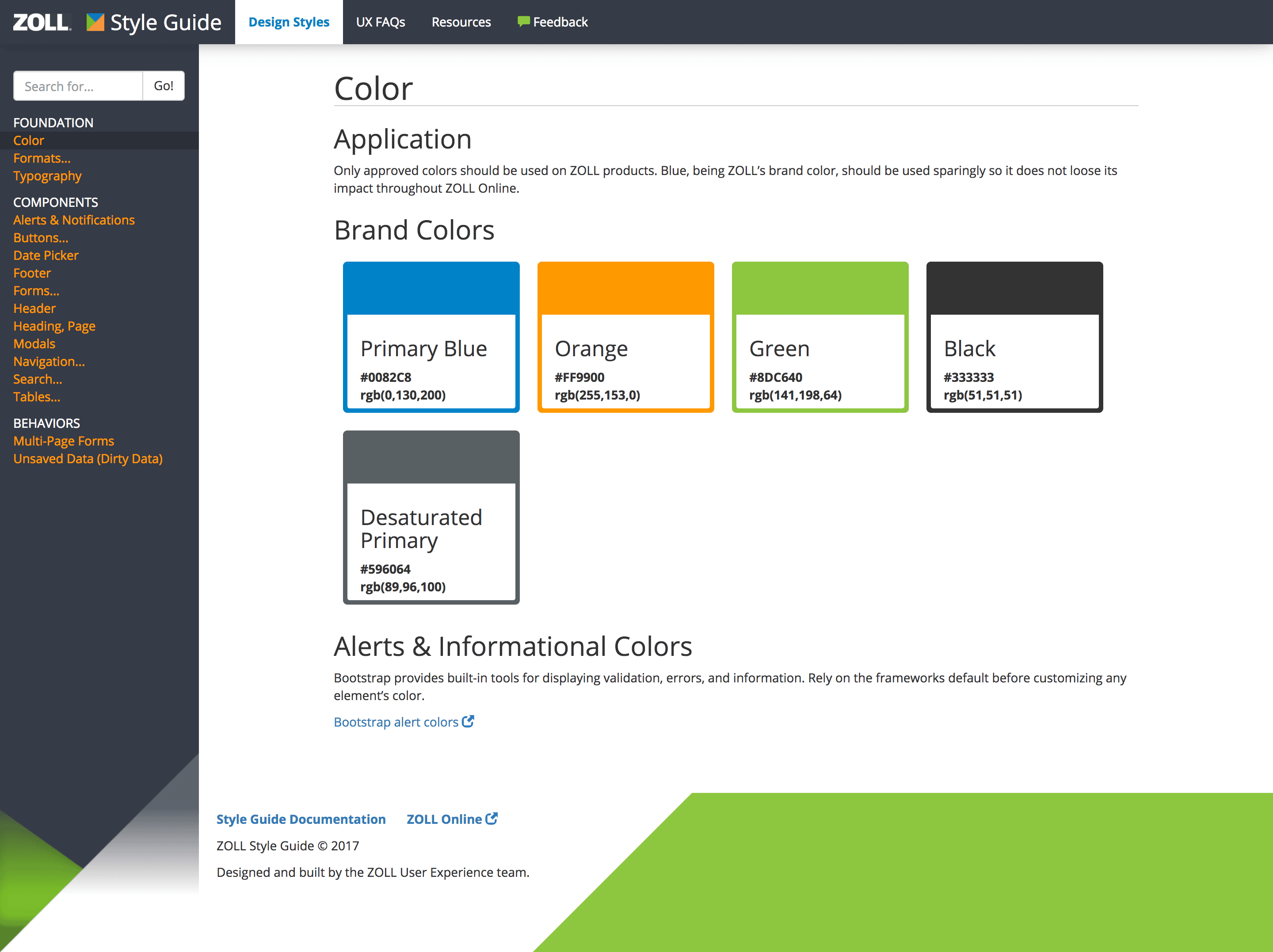
Given that challenge, we shifted tactics and went full user-interface-user-experience-guide instead. This guide was to focus on UX patterns, UI design principles, and even content tone-of-voice and formatting. It was still destined to be a valuable tool, helping get all the teams on the same design-page.
As stated above, the UX team had no back-end developers. We also had no access to developer time and talent because resources were stretched thin. Because of these constraints, I determined:
- The style guide should live outside the company’s codebase so it does not depend on anyone or any stack for deployment
- The style guide should be fairly language agnostic, so it can be picked up at any time and augmented or folded into another codebase
- It must be (somewhat) easy for a designer with basic coding skills to contribute
- It must have clear documentation so the information is not siloed
Given this criteria, I built the style guide upon the Jekyll framework. Jekyll is a static website generator, which was a perfect tool for the job. A static website can be hosted anywhere, is generally light-weight, has few dependencies for deployment, and has virtually zero security issues since there are no databases or user information to compromise. While there were plenty of other options, I preferred Jekyll since I’ve spent my last few years working with it extensively.
We broke the guide into three primary sections.
Design Styles
Design Styles contained the meat of the style guide. In it, the style components were broken into three sections:
- Foundation
These were guides regarding the basics of the site. Color, typography, formatting, etc. - Components
These guides focused on UI components: form controls, breadcrumbs, etc. - Behaviors
Primarily UX patterns that involved setting guidelines around how a user interacted with the website components.

UX FAQs
While I’m generally not a fan of FAQ pages (because most FAQ questions are fake), the UX team legitimately receives frequently asked questions, so it really did seem appropriate.
Documentation
This documentation was for the style guide itself, and outlined everything from installation of the Jekyll framework, to how to make a component style and markdown, to deploying the site to production.
Guide Components
Within the format, there were some important site components that aided the user’s experience.
Search
The goal was to make the guide easy to use, and also attractive so developers would return. Search was implemented for this reason. I have viewed a fair amount of style and pattern guides in my time, and I’m surprised at how few have a search. It's common that a user will not know exactly what they are looking for, so blindly clicking links can become a frustrating task. Allowing the user to simply type in a few keywords virtually eliminates this frustration.
Cross-Referencing
This was one of the more manual aspects for me to set up, but the team felt it was important to provide cross-linking between related styles to help give context, but also to aide that user who may be hunting through the guide and hasn’t realized they can search!
Feedback
We built the style guide for developers, and we wanted and needed their input. My philosophy from the start was that this was the collective’s guide, so everyone who wanted to have a say could have a say. We provided a feedback link that was hosted by Survey Monkey, in which we provided a simple comment box for their feedback and/or suggestions.
Results & Beyond Release
We released the guide to a warm reception from the company and developers. Many devs had been asking for something like what we produced, and were happy to have it. The first iteration of the guide was in no means exhaustive, however. For the sake of time, and the need to ship something, we released with a handful of well-crafted guides, but with a mountain of content still in the backlog.