Case Study
Recipe Site Case Study
Project Overview
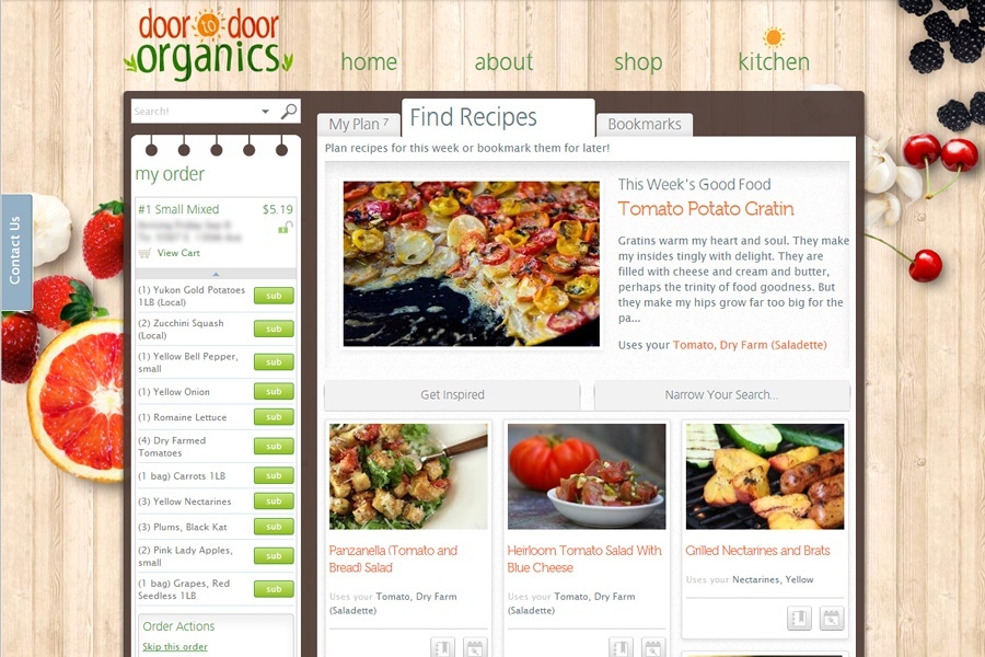
Door To Door Organics is an online organic produce and market delivery service that, at the time of this project, covered five locations nationwide. As part of the company's commitment to their customers eating good food, Door To Door Organics decided to launch a recipe and meal planning “wing” to the website that would ultimately be incorporated into the future website shopping flow. The recipe site would bring the customer’s grocery box, with all of its ingredients, together with recipes to help provide inspiration in the kitchen and reduce food waste. This project would require:
- A brand new design and code infrastructure
- An engaging user experience that would be easy to use and make people want to come back
- Ultimately growth in customer engagement, retention, and sales
Project Role
I was the designer on a three person team that also included a web developer and product manager.
Team
- Kristin Lindquist - Product Manager
- David Rudder - Senior Software Developer
- Christan Fergus - Senior Web Designer
Process
Useability Design
This project was an added feature that was not necessary to our customer’s core experience of modifying their orders and buying products. It was therefore important we make the recipe site extremely easy to use as a valuable enhancement to an existing shopping experience. We achieved this by endeavouring to only show the user relevant and meaningful information. Discovering the line between too little and too much was and is an on-going process.
Visual & Front-end Design
The design process started quickly based on the product manager's wireframes and design briefs. Moving quickly into this phase allowed us to get a good feel for how the design was going to work very early on. Working in an Agile environment provided the needed flexibility to revisit, test, and is some cases do away with concepts and designs throughout the entire process.
The front end leveraged HTML5 and some newer elements of CSS3, however the requirement of supporting Internet Explorer 7 and up prohibited anything too fancy. Javascript was used a fair amount and necessary for not only enhancing the visual experience, but also as a conduit to serve up content via Ajax in some cases. Great care was taken to only use Javascript when absolutely necessary.
Back-end Design
David Rudder handled the software development, and we worked together through the whole project. The back end of the site was built utilizing the Java framework, Play. This, of course, was the core of the web site. Some requirements and complexities included:
- The ability to quickly sift through the user’s customer data, thus showing them relevant recipes based on their order and seasonal factors
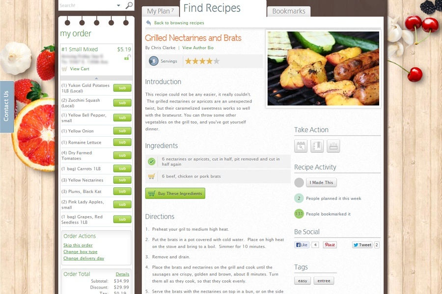
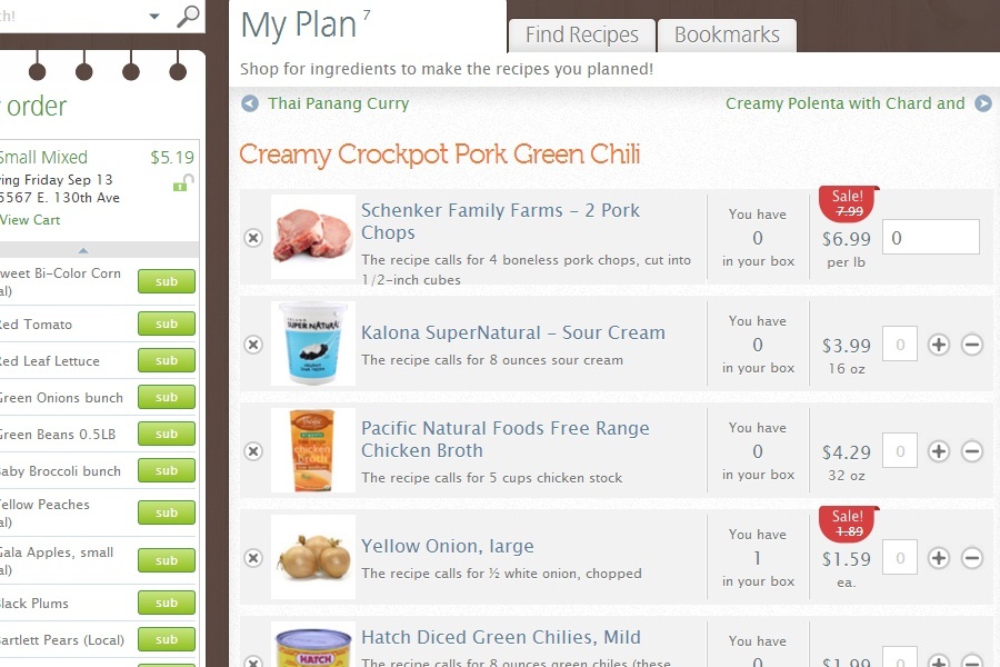
- The ability to purchase products directly from recipes
- Provide a custom CMS for easy recipe input by the Door To Door team
User Testing
User testing was implemented late in the process, something that since has been modified in our team’s creative process, but we did do live user testing, think-aloud, and A/B testing and continue to perform tests even after release.
A 13% larger basket size was achieved.
Challenges
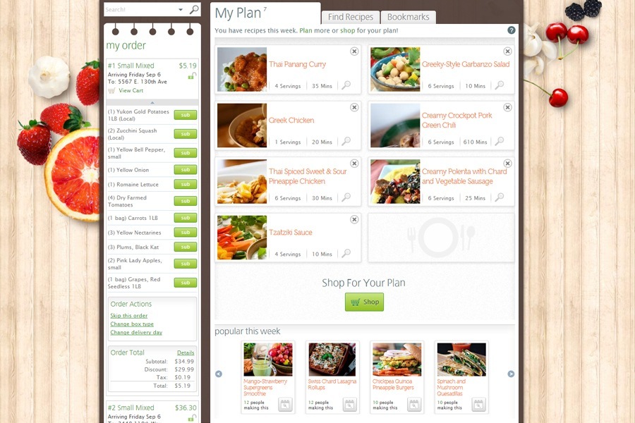
This wasn’t a static recipe site, this was a recipe site that recommended recipes to you based on items that were in your weekly order. Because of this we needed to be able to detect which ingredients you had and didn’t have, and give you the ability to modify your order based on this information. The marriage of sales and recipes was a great one, but a concept full of complexity that had to be distilled and offered up quickly for the customer’s benefit. Knowing what data to give, when to give it, and most importantly, how, was a major challenge.
We also had a fair amount of information we needed to convey to the user in a very limited space. Part of the space limitation was because the recipe site was built as an evolutionary branch off of the existing site. That design presented limitations primarily because we didn't want each area of the site looking drastically different to the user. We handled this challenge by reigning the design back in some places, removing elements that weren't expressly needed, and also modifying some visual elements the existing site in minor ways.
Results & Beyond Release
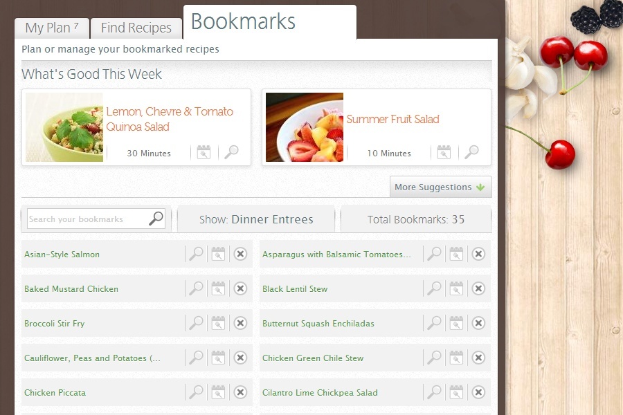
Feedback and site usage were extremely positive and we successfully created a fun and meaningful way for customers to plan their week in recipes. As a result we experienced
- Overall customer retention increased with a 17% increased customer conversion rate
- On average 13% larger basket size
As the Door To Door Organics recipe site has been live and active now for some time, we continue to respond to the data we receive and adjust accordingly. Since the original release, we have had a V1.5 release where we fixed some bugs and polished some functionality.
Screen Shots
Overall customer retention increased with a 17% increased customer conversion rate and an average 13% larger basket size.
