Thought Leadership
Communicating Iterative Design With Better Context
The message we're sending in a popular iterative design image may not be the right one.
I’m writing this little piece because I have, yet again, encountered understandable resistance from some colleagues around a popular illustration that makes its rounds on the internets. Ultimately, the resistance points to a deeper underlying business issue (in my case the forced clash of waterfall with and “agile”) that tends to be highlighted when I or a UX cohort attempts to explain iterative design. So here we go...
By now, if you’re on any kind of product team with user experience designers, you’ve probably seen the image by Henrik Kniberg illustrating the better way to design and release product features. Take a look . I don’t own the image, so I won’t show it on my site, but it’s important to the rest of this post. Henrik wrote a thorough blogpost which does discuss this image in more depth that I encourage you to read as well.
The concept is that instead of releasing pieces of a thing you want to build–none of which actually work until the final component is added–you release usable pieces that actually function and provide value along the way. Each mode of transportation, from skateboard to car, will get you to your destination. The difference is how developed and effective that mode of transportation is.
I want to emphasise that I’m not taking issue with this lean, iterative approach. I also want to emphasize I’m not being petty and over-analysing an image that is used to help illustrate a concept. The image works well if it’s part of a larger, meaningful conversation. The problem is (I’m guilty too) it’s too often shared without context, and I’ve seen it sour colleague’s perspectives on the job we, as UX product designers, are trying to do.
But here’s the deal: as user experience designers, our job is to not only communicate and design effectively for our users, but to do the same for our internal users-stakeholders, product managers, developers, etc. This is where I’ve experienced this illustration breaking down. The image is very effective, and it sticks in our co-worker’s minds. The moment a team member–one who is not used to lean or agile iterative design–sees the diagram, they fixate on the final stage, and insist that we are not providing any value to the user because that user wants a car (developers and sales tend to be unified in this critique). In addition, they see the sad face at the beginning and ask why on earth would we deliver something that makes the customer sad? Whether or not that’s what’s intended by the image, that’s a message being delivered.
I believe this is the root of the challenge. The assumption in this illustration is that the user, from day one, needs a car. What we’re doing, then, is continually delivering a product that does not meet that user’s needs until that car is produced. It seems like we’re just screwing with the customer until we finally produce what they want. And you know what, in this context, those who push back on this: developers, product managers, salespeople, etc., are justified.
Instead, we need to find a way to display the fact that the end result may not actually be a car. It may be an airplane, it may actually stay at the bicycle stage. While it’s entirely appropriate and necessary to have a business roadmap that says we want to meet a customer and business need, it’s hasty to detail exactly what that way will be. We are in danger of ultimately building the wrong thing if we determine a car needs to be built from the get-go. So how do we illustrate that in a consumable illustration?
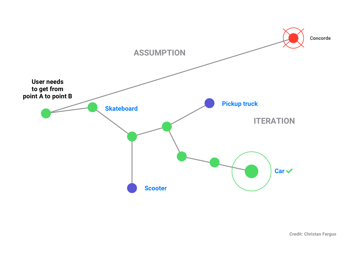
I think it’s useful to leverage the “dots” illustration. It’s not original to me, of course, but I do prefer it to the alternative if the alternative cannot be matched with a thorough explanation. The dots can show a similar concept, but illustrate the fact that iteration gets both the user and the business to a place that meets their needs. It’s not perfect. As with all metaphors, they eventually break down. The point, however, is to convey how iteration can work for both the business and the user and contrast that with the alternative of a large, major release.
You can see in the illustration that some wrong turns can be made, but those wrong turns are easily corrected and all happen on the way to ultimately delivering the right thing. It also gives clarity to the branching that assumption (regardless of how well researched) can potentially lead in a different and wrong direction that costs the business and user money they shouldn’t have to spend.
I will emphasize again how important it is for us UX designers to ensure effective communication happens with our teams and company. We are ambassadors from our company to our customers, and, just as importantly, from our customers to the business. We must take care that the messages we are sharing are clear, concise, and have value that teams can understand and utilize.